Geometric Soul
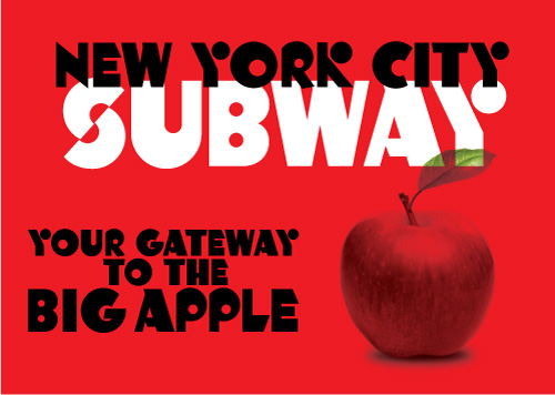
This font was created in 2004 as part of the Jukebox library. I decided to play around with some different simple shapes like circles and squares to see what forms I could create.
Gradually, I began to form those shapes into letters. In order to have letters be readable and therefore make a typeface viable, they still have to be recognizable as the letters they are. I wanted to see how much I could amend the traditional letterforms using these simple geometric shapes while still retaing their essential design.
What emerged was a typeface that was completely original (not based on any inspiration) and had a decidedly 1970s feel to it reminiscent of Milton Glaser’s work. Glaser was the genius behind the “Babyteeth” and “Glaser Stencil” typefaces. Geometric Soul seemed to be the perfect name for the font.
All of the curves and rounded letters in Geometric Soul are circular (not elliptical) and so are the counterspaces in letters like the P, B and O. Several of the endstrokes on letters like the E, L and T are angled to give the font extra energy and keep it from being too repetitious. Diagonal lines are always more energetic than horizontal or vertical lines. Diagonals imply motion and thrust while horizontal or vertical elements denote stability.
One ascpect of this font I particularly like is the use of circles to create some of the parts of the letters that are usually lines. This design device is seen most noticeably the K and Y but is also seen in the Q, X and Ampersand. As a result Geometric Soul is still very legible, but imparts a unique and graphic look to any design.
Since this font reminded me of the designs popular in the 1970s when I was a child, I created a sample of it on my then website depicting a fictional book title called “The Art of Milton Glaser”. Imagine my thrill and surprise when I was told by a colleague that Glaser himself had seen the sample and liked the font! It turns out she worked with him in her office and that was quite a moment for me, as we had studied Glaser’s work in my History of Graphic Design class at Kean University.
Geometric Soul is part of the Jukebox library at Veer, and is now available in OpenType format.


No comments:
Post a Comment