Wednesday, March 12, 2014

Font of the Week #7: Annabelle

   Hello to my readers! I have had a busy week so the Font of the Week is going up on Wednesday instead of Tuesday. This week we will take a look at “Annabelle”.

Annabelle

   Annabelle is an original font that is part of the Jukebox library. The design was inspired in part by an old greeting card. This font is the first we have looked at that is named after a real person who is special in my life. In this case my mother:

Well, sort of…

   My mother’s name is actually Ann, but my dad used to call her ‘Annabelle’ as an endearment. Back when this font was designed in 2002, I was working in the old PostScript format and font names had to be a certain number of characters in length. The name Ann was too short and Annabelle seemed a more appropriate name for the design. The font was completed that same year and originally was available as part of my first foundry at MyFonts.com.


   Annabelle is a flowing script font that is Spencerian in its major design elements yet has a warm playfulness to it that prevents it from being overly formal. The long loopy strokes and somewhat wider letterspacing than is typical for a script font, gives it a very feminine feel.

   My mother taught high school English and American Literature for many years and Walt Whitman was one of her favorite authors. The above quote from him resonates with me not only for relating to my mom, whom the font is named after, but in awe of how right he was about the nature of existence.

   In the decades to come after Whitman lived, scientists indeed discovered that all the necessary chemical elements that make up life on Earth were formed in the cores of stars and returned to space when those stars exploded as supernovae. As Carl Sagan said, “We are made of star stuff”.

   Annabelle has proven to be one of the more popular fonts in the Jukebox library and has enjoyed use on many commercial products and even on television. My personal favorite use of the typeface was on the cover of photographer Anne Geddes’ autobiographical book entitled “A Labor of Love”.


Tuesday, March 4, 2014

Font Of The Week #6: Andantino

I hope everyone is having a great week and enjoyed the Oscars this past Sunday! It's time again for my font of the week. This week we will take a look at Andantino…

Andantino

   Andantino is a script font from the Jukebox library and it is a digital revival of an old photo-typositing face called “Adagio”. The original was designed in 1953 by Karl Klauss for Geuzsch & Heyse. The font never made it into the digital era, so I finally did that for Jukebox in 2003.

   The name Andantino like Adagio, is a musical term. Andantino is an Italian word that refers to a medium-slow tempo at which the music should be performed. I have often found many parallels between music and fonts given the variety and combinations which 26 letters or 12 notes can create. That is one of the reasons I felt that musical terms were perfect for both of my foundry names: Jukebox and CounterPoint.


  Andantino has a classy and refined feeling to it, and yet is approachable as well. It seems to be the perfect font for wedding invitations or semi-formal events. As a script font it has the interesting design element of non-connecting lower case letters which is part of why it has a more upscale feeling. The one-step-removed from true script writing bridges the gap between a handwritten font and a purely designed print face.

   A notable use of Andantino is on the cover of Debbie Macomber's Book “Home for the Holidays”.


Tuesday, February 25, 2014

Font of the Week #5: “Califunkia” by CounterPoint

   Good morning to everyone! I hope your week has been happy and productive. It’s time for Font of the Week #5. This week’s feature is Califunkia from my recently launched CounterPoint Type foundry.

Califunkia

   The design for Califunkia was inspired by a hand lettered sample in a book about old 1960s advertising and lettering for ads. I wanted to make use of numerous interlocking ligatures with this font in order to give it a more handdrawn feel. The technology of OpenType has been a real boon to font designers! Now we can use the almost unlimited number of glyphs available, as well as the automatic substitution features that OpenType provides to give the end user a font which is much more fluid and organic in its design.

   Gone are the days when we were limited to 256 characters per font and you had to actually create a seperate font for any swash or special characters that went with it. This makes OpenType fonts much easier for designers to use and gives the font developers almost unlimited creative opportunities with the typeface.

   With Califunkia I added over 260 specially designed ligatures to give the font a wide range of possibilities. Shown below is only a small sample…


This less “computery” hand lettered look is the future of OpenType, in my opinion and great use has been made of it so far. 

   The name Califunkia seemed to me to be the perfect fit. It incorporates the name of my home state as well as the word “funk”. The design of this font seemed to call up feelings of those 60s & 70s designs when funk music was so popular.


   Califunkia can be purchased directly from me, or at several online font vendors including Monotype (Fonts.com), MyFonts.com, FontHaus and Veer.

Friday, February 21, 2014

Jukebox Font Sighting at Disneyland!

   Good morning! I was pleased and excited to find this Jukebox font sighting at Disneyland recently! Kon Tiki Aloha, is being used on this sign for the 50th Anniversary exhibit on the famous Enchanted Tiki Room attraction.


Tuesday, February 18, 2014

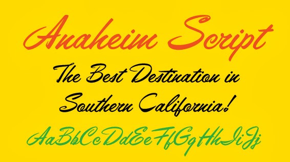
Font of the Week #4: Anaheim Script

   Good afternoon to everyone! Time for the font of the week again. This week's feature is Anaheim Script from Jukebox.

Anaheim Script

   Anaheim Script was inspired by some hand lettered ad samples in a “how-to” book on lettering. I love this font’s lively and energetic design that is so reminiscent of 1950s and 1960s advertising. The original font was released in 2007, with an updated OpenType Pro version that was relased in 2010. The Pro version added two full sets of alternate caps as well as support for Eastern European languages as well as other basic OpenType features.

   The name was inspired by the town in Southern California, which is where I live. Anaheim was settled by German immigrants in the 1850s. Since the Santa Ana River runs through the area, in German the name roughly translates as “Home by the Ana”

   Anaheim is the 10th largest city in the state and is most famous for being the home of the original Disneyland. Before Walt built his park here, Anaheim was a rural community of mostly orange groves and farms. Once Disneyland arrived in 1955, Anaheim grew up quickly around it to be a vibrant and active city. Anaheim is also home to the Mighty Ducks hockey team and the Anaheim Angels baseball team. Angel Stadium is easily recognizable with its giant red “A” surrounded by a halo which is visible from the 57 south freeway.

   I chose to name the font not only in honor of where I live, but the 1950s designed seemed to go hand-in-hand with the growth of the city during that time.

 Link to Anaheim Script at Veer

   Anaheim Script Pro is perfect for any design that needs a fun and casual script font with flair…or anything that needs to evoke a 1950s ad feel.

   A recent and notable use of Anaheim Script was on the cover of Richard Russo’s book “That Old Cape Magic”.


Tuesday, February 11, 2014

Font of the Week #3: Alpengeist

Greetings to all! I hope this week finds you well and happy. It’s time for the Font of the Week again…

Alpengeist

   Alpengeist is a display face from Jukebox, loosely based on the European blackletter designs of eras past. The actual inspiration for the font came from the hand-lettered sign for the Matterhorn Bobsleds ride at Disneyland.

   Starting with only the letters that appear in the word “Matterhorn”, I adapted the design into a full typeface. By and large Alpengeist is a display font, meant to convey the fairy tale-like and idealized vision of Alpine culture, rather than be a strictly true blackletter face. Surprisingly enough, fonts like this (and even more elaborate) were once actually used to set text in German newspapers.

   The name ‘Alpengeist’ is a German word that literally translates as “spirit of the Alps”. However, the word can also refer to the mythical fur covered monster that supposedly lives in the Alps…very similar to the abominable snow monster or an Alpine Bigfoot. There is also a roller-coaster called Alpengeist at Busch Gardens.

   This font was designed in late 2001 and was part of the original Jukebox library that launched in 2003. Interestingly, the font ended up coming full circle and was later used by Disney for the Matterhorn Bobsled pin, when pin trading became all the rage a few years back.


Alpengeist is perfect for any design that needs that old world Swiss/Bavarian feel to it. Now available in OpenType from Jukebox Fonts website


Tuesday, February 4, 2014

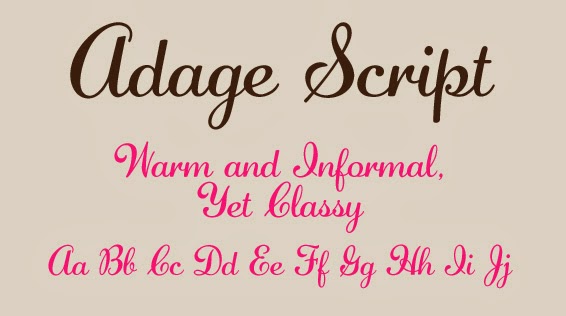
Font of the Week #2: Adage Script

   Hello everyone! I hope you’ve had a good week. Well, it’s February now so the year is rolling along. It’s time for Week #2 of the Font of the Week feature…

Adage Script

   Adage Script is a digital revival from Jukebox that was created in 2002. I created a series of five script fonts during the summer of that year, of which Adage Script is one. This was originally part of the JAW Fonts library that was once sold through MyFonts.com before becoming Jukebox when I partnered with Veer.

    Warm and nostalgic, Adage Script is a casual style script font that reminds me of sunny Sunday afternoons in small town America. Those associations gave rise to the name since the word “adage” seems to inherently imply times gone by and sage advice given by loving grandmothers who seek to pass on the lessons learned over a lifetime of joys and sorrows. Adage Script is feminine yet strong and bold in its simple curves.

Adage Script

   As a casual script, Adage Script is less formal than something like a Spencerian or Copperplate script. Casual script fonts are perfect for any design that needs a personal and approachable feel without getting too fancy or ornate.