Wednesday, July 22, 2015

Font of the Week #47: Geometric Soul

   Hello again and welcome back to the Font of the Week! This post will examine a funky and unique font that I had a lot of fun working on.

Geometric Soul

   This font was created in 2004 as part of the Jukebox library. I decided to play around with some different simple shapes like circles and squares to see what forms I could create.

   Gradually, I began to form those shapes into letters. In order to have letters be readable and therefore make a typeface viable, they still have to be recognizable as the letters they are. I wanted to see how much I could amend the traditional letterforms using these simple geometric shapes while still retaing their essential design.


   What emerged was a typeface that was completely original (not based on any inspiration) and had a decidedly 1970s feel to it reminiscent of Milton Glaser’s work. Glaser was the genius behind the “Babyteeth” and “Glaser Stencil” typefaces. Geometric Soul seemed to be the perfect name for the font.

   All of the curves and rounded letters in Geometric Soul are circular (not elliptical) and so are the counterspaces in letters like the P, B and O. Several of the endstrokes on letters like the E, L and T are angled to give the font extra energy and keep it from being too repetitious. Diagonal lines are always more energetic than horizontal or vertical lines. Diagonals imply motion and thrust while horizontal or vertical elements denote stability.


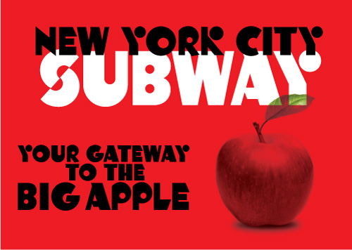
   One ascpect of this font I particularly like is the use of circles to create some of the parts of the letters that are usually lines. This design device is seen most noticeably the K and Y but is also seen in the Q, X and Ampersand. As a result Geometric Soul is still very legible, but imparts a unique and graphic look to any design.


   Since this font reminded me of the designs popular in the 1970s when I was a child, I created a sample of it on my then website depicting a fictional book title called “The Art of Milton Glaser”. Imagine my thrill and surprise when I was told by a colleague that Glaser himself had seen the sample and liked the font! It turns out she worked with him in her office and that was quite a moment for me, as we had studied Glaser’s work in my History of Graphic Design class at Kean University.

   Geometric Soul is part of the Jukebox library at Veer, and is now available in OpenType format.

Wednesday, July 15, 2015

Font of the Week #46: Gemini

Hey there and welcome back! My featured font for this week takes us into the zodiac and the sign of the twins. A fun font called Gemini

Gemini

   This font is another digital revival form Jukebox based on an older photo-lettering face called Jiminy. As with all my digital revivals, I carefully traced each exisitng letter to be faithful to the original and then fleshed out the typeface to work for the digital age.


   Gemini is a fun and fantastic throwback to the handlettering of the 1950s. Filled with sparkle and happy-go-lucky innocence, this font is perfect for anything that relates not only to the 1950s or 1960s but also works with childlike and family themes.

   Gemini is an all caps font with makes it perfect for advertisements and bold attention-getting lettering.  It has a slightly modulated baseline, alongside rough-hewn end strokes that give it its casual feeling.


   The font also has a strong verticality to the design which means it works well on signage and posters. It makes me think of fun summer nights at a carnival. I can smell the hotdogs and cotton candy! 

   Gemini has been upgraded to OpenType format and is available through Veer as part of the Jukebox library.


Wednesday, July 8, 2015

Font of the Week #45: Fuzz Guitar

   Hello and welcome back to another font of the week feature from Walcott Design! This week we will get on our groovy and travel back to the 1960s with Fuzz Guitar.

 Fuzz Guitar

   This font was pure fun to create! A digital revival of a typeface from an old Dover book, this font is the quintessential 1960s hippie free-love culture font! With its heavy bottoms that are reminiscent of bell-bottom pants, it calls up those memories of Janis Joplin, Jimi Hendrix and Woodstock.

   That era was the time of my parents and so it is not only a cool and interesting time in terms of design but brings up memories of when the baby noomers were young and life was just beginning for their generation.


   The typeface itself has its design roots in the Art Noveau era which came back into fashion during the 1960s and influenced the design for the Flower Power era. These types of fonts were often used on posters for rock concerts which inspired the name “Fuzz Guitar”. It just seemed to be the perfect fit.

   It is an all caps font which helps the unusual shape of the letters hang together a little better than would be the case with a true lowercase set.


   This font is perfect for any design that needs to evoke the era of the 1960s, hippie movement or the rock music from that decade. 

   Fuzz Guitar is available from Veer as part of the Jukebox Type library and is available in OpenType format. 


Wednesday, July 1, 2015

Font of the Week #44: Funny Bone

Hello and welcome back to another Font of the Week! This I'm going to tickle you in the ulnar nerve with my font called “Funny Bone”…

Funny Bone

   Based on a font found in an old Dover type book, Funny Bone was created in 2004 and is part of the Jukebox library at Veer.

   The fun and whimsical design of the letters in Funny Bone make it a perfect font for and lighthearted and kid-friendly purpose.


   The heavily modulated baseline gives the letters a bouncy feel that project energy and joy! The design also makes use of a mix of small cap and more traditional letter designs in the lowercase, giving the typeface a much more casual hand-drawn feel.

   In addition, some of the letters end in a curly cue ball terminal which adds a slightly feminine touch to those letters. That keeps the font approachable and familiar. 


   Funny Bone has been a good seller for Jukebox and I continue to see it out in the world…always a fun thing to spot! The photo below shows and example just from this past autumn. Funny Bone was used on Mars Co. candy display signs for their 2014 Halloween line. This was snapped at the Ralphs grocery store near me where I shop.


   As with the other fonts in the Juekbox library, Funny Bone is available in OpenType format.