Wednesday, August 19, 2015

Font of the Week #49: Giggle Script

   Hello again! Welcome back for another Font of the Week. Who doesn't love to share a laugh with a friend? This week's font, Giggle Script, was named for just that and the whimsical design that seem to inspire a sense of humor.

Giggle Script

   This unusual script font was based on just a few letters found in a hand-drawn logotype from the 1960s. If I remember correctly the original two words were "Christmas Greetings" so those are the only letters I had to work with to build an entire typeface. I love challenges like this were I get to really stretch my type design muscles!


   What grabbed me about this design is the unique combination of script and blackletter elements. It seems to combine some old time calligraphic strokes with the more modern look of a 1960s script typeface. I love designs that can marry two different visual aspects like this!

   The small x-height and large skinny capital letters give the typeface a whimsical look. When combined with the modulated baseline this makes the font look like it's laughing, hence the name Giggle Script. Most of the letters are upright but a few are slanted to the left which is the opposite of the natural right-leaning slant of most script faces. Notabley the lowercase h and r. This adds to the childlike feeling of the font and makes sure it doesn't take itself too seriously.


   I had a great deal of fun working on this design which was completed in 2007. Giggle Script is part of the Jukebox library, and is available at Veer.com in OpenType format.


Wednesday, August 12, 2015

Font of the Week #48: Gibson Girl

Hello again! It's great to have you back here. Now it's time for another Font of the Week and this time we will take a look at my font called "Gibson Girl".

Gibson Girl

   Gibson Girl is part of the Jukebox library and was designed in spring of 2009. Based on a hand-drawn alphabet in a "how-to" book on hand lettering, Gibson Girl reminded me of the 1890s style script fonts often seen on advertisements and signage from that period.


   The name seemed the perfect fit for the font. Charles Gibson was an illustrator popular during the Gilded Age whose stylized drawings of young women became all the rage…they were the supermodels of their day and the "Gibson Girl" became the ideal of young female beauty at that time.

Typical "Gibson Girls"

   Although a script font, Gibson Girl has a very stylized design that makes it perfect for many applications that need to make a heavy, bold statement. The high contrast between the thick and thin strokes gives the font character and a sense of movement while at the same time seemingly solid and confident. Much like the Gibson Girl herself who was bold and self-confident yet feminine and graceful. It is a design that is clearly drawn rather than "written".


   With its large x-height and bottom heavy letterforms, Gibson Girl is warm and approachable and carries no hint of aloofness or pomp. 

   The font contains a full character set that supports all Latin-based and Eastern European languages and is available from Jukebox in OpenType format. 

Wednesday, August 5, 2015

Jukebox Fonts now at MyFonts.com!!

   Hello fellow type lovers! After several months of preparation and negotiations, I have some exciting news to share with you...

   A selection of 40 hand-selected typefaces from the Jukebox collection are now available through MyFonts.com! After 12 years of exclusivity through Veer, I am excited that some of these wonderful fonts I created have returned to MyFonts.com where I got my start with JAW Fonts way back in 2001.


   I feel this offers an exciting new opportunity for Jukebox to reach a larger audience, as MyFonts.com is one of the most popular font retail websites on the internet. 

   The 40 fonts chosen to offered through MyFonts, were carefully selected to best represent the strongest work in the Jukebox library that provides the most versatility for designers and type-lovers alike!

   We have already seen some great response to this campaign, so I invite you to come and join the fun! Below is just a sample of some of the fonts available...


Wednesday, July 22, 2015

Font of the Week #47: Geometric Soul

   Hello again and welcome back to the Font of the Week! This post will examine a funky and unique font that I had a lot of fun working on.

Geometric Soul

   This font was created in 2004 as part of the Jukebox library. I decided to play around with some different simple shapes like circles and squares to see what forms I could create.

   Gradually, I began to form those shapes into letters. In order to have letters be readable and therefore make a typeface viable, they still have to be recognizable as the letters they are. I wanted to see how much I could amend the traditional letterforms using these simple geometric shapes while still retaing their essential design.


   What emerged was a typeface that was completely original (not based on any inspiration) and had a decidedly 1970s feel to it reminiscent of Milton Glaser’s work. Glaser was the genius behind the “Babyteeth” and “Glaser Stencil” typefaces. Geometric Soul seemed to be the perfect name for the font.

   All of the curves and rounded letters in Geometric Soul are circular (not elliptical) and so are the counterspaces in letters like the P, B and O. Several of the endstrokes on letters like the E, L and T are angled to give the font extra energy and keep it from being too repetitious. Diagonal lines are always more energetic than horizontal or vertical lines. Diagonals imply motion and thrust while horizontal or vertical elements denote stability.


   One ascpect of this font I particularly like is the use of circles to create some of the parts of the letters that are usually lines. This design device is seen most noticeably the K and Y but is also seen in the Q, X and Ampersand. As a result Geometric Soul is still very legible, but imparts a unique and graphic look to any design.


   Since this font reminded me of the designs popular in the 1970s when I was a child, I created a sample of it on my then website depicting a fictional book title called “The Art of Milton Glaser”. Imagine my thrill and surprise when I was told by a colleague that Glaser himself had seen the sample and liked the font! It turns out she worked with him in her office and that was quite a moment for me, as we had studied Glaser’s work in my History of Graphic Design class at Kean University.

   Geometric Soul is part of the Jukebox library at Veer, and is now available in OpenType format.

Wednesday, July 15, 2015

Font of the Week #46: Gemini

Hey there and welcome back! My featured font for this week takes us into the zodiac and the sign of the twins. A fun font called Gemini

Gemini

   This font is another digital revival form Jukebox based on an older photo-lettering face called Jiminy. As with all my digital revivals, I carefully traced each exisitng letter to be faithful to the original and then fleshed out the typeface to work for the digital age.


   Gemini is a fun and fantastic throwback to the handlettering of the 1950s. Filled with sparkle and happy-go-lucky innocence, this font is perfect for anything that relates not only to the 1950s or 1960s but also works with childlike and family themes.

   Gemini is an all caps font with makes it perfect for advertisements and bold attention-getting lettering.  It has a slightly modulated baseline, alongside rough-hewn end strokes that give it its casual feeling.


   The font also has a strong verticality to the design which means it works well on signage and posters. It makes me think of fun summer nights at a carnival. I can smell the hotdogs and cotton candy! 

   Gemini has been upgraded to OpenType format and is available through Veer as part of the Jukebox library.


Wednesday, July 8, 2015

Font of the Week #45: Fuzz Guitar

   Hello and welcome back to another font of the week feature from Walcott Design! This week we will get on our groovy and travel back to the 1960s with Fuzz Guitar.

 Fuzz Guitar

   This font was pure fun to create! A digital revival of a typeface from an old Dover book, this font is the quintessential 1960s hippie free-love culture font! With its heavy bottoms that are reminiscent of bell-bottom pants, it calls up those memories of Janis Joplin, Jimi Hendrix and Woodstock.

   That era was the time of my parents and so it is not only a cool and interesting time in terms of design but brings up memories of when the baby noomers were young and life was just beginning for their generation.


   The typeface itself has its design roots in the Art Noveau era which came back into fashion during the 1960s and influenced the design for the Flower Power era. These types of fonts were often used on posters for rock concerts which inspired the name “Fuzz Guitar”. It just seemed to be the perfect fit.

   It is an all caps font which helps the unusual shape of the letters hang together a little better than would be the case with a true lowercase set.


   This font is perfect for any design that needs to evoke the era of the 1960s, hippie movement or the rock music from that decade. 

   Fuzz Guitar is available from Veer as part of the Jukebox Type library and is available in OpenType format. 


Wednesday, July 1, 2015

Font of the Week #44: Funny Bone

Hello and welcome back to another Font of the Week! This I'm going to tickle you in the ulnar nerve with my font called “Funny Bone”…

Funny Bone

   Based on a font found in an old Dover type book, Funny Bone was created in 2004 and is part of the Jukebox library at Veer.

   The fun and whimsical design of the letters in Funny Bone make it a perfect font for and lighthearted and kid-friendly purpose.


   The heavily modulated baseline gives the letters a bouncy feel that project energy and joy! The design also makes use of a mix of small cap and more traditional letter designs in the lowercase, giving the typeface a much more casual hand-drawn feel.

   In addition, some of the letters end in a curly cue ball terminal which adds a slightly feminine touch to those letters. That keeps the font approachable and familiar. 


   Funny Bone has been a good seller for Jukebox and I continue to see it out in the world…always a fun thing to spot! The photo below shows and example just from this past autumn. Funny Bone was used on Mars Co. candy display signs for their 2014 Halloween line. This was snapped at the Ralphs grocery store near me where I shop.


   As with the other fonts in the Juekbox library, Funny Bone is available in OpenType format.


Thursday, June 25, 2015

Font of the Week #43: Frolic

   Hello again! This week, for the Font of the Week feature, we have a typface from the Jukebox library called “Frolic”.

Frolic JF

   My Frolic font is a fun and lighthearted typeface that is whimsical, playful and is meant to evoke a sense of childhood exuberance and joy.

   It is the perfect font for any design or document that needs that touch of carefree fun.


   This font was inspired by the lettering often seen in 1950s and 1960s advertisements, especially for kid related items. I wanted the font to bring the viewer back to that long ago time.

   This carefree feel is acheived through the large x-height, modulated baseline and the off-vertical stems and ascenders. 

   Fonts like Frolic are really fun to design because they allow me as a creative, to put more of my personality into the end result. 


   Frolic was created in 2009 and is part of the Jukebox library available through Veer. The font now comes in OpenType format. 


Friday, June 19, 2015

Font of the Week #42: Friki Tiki

   Hello again! I am finally back with another Font of the Week and this time we’ll take a closer look at another popular seller from Jukebox:

Friki Tiki

   Naturally this Polynesian themed typeface brings to mind visions of Hawaii, tropical beaches, warm sunsets and piña coladas. Based on a hand-lettered logoptype for a Polynesian-themed restaurant, I took away what I liked from that lettering sample and developed it into the Friki Tiki typeface.


   I love the blocky, yet fun feeling to the letters that invites you in…much like the welcome of a luau and the “Aloha” spirit of Hawaii. 


   As part of the design, I added in several ligatures and alternative lowercase letters that are raised off the baseline with blocks underneath. This helps add that hand tooled look to the font, reminiscent of retro tiki design. I wanted to capture that sensibility in the forms of this typeface.

   Friki Tiki has been a relatively good seller for Jukebox over the years, and I am proud to share that it has been used on a number of different commercial products and applications that were related to Hawaii and a Polynesian theme.

    Two of my favorite examples are shown below. The first is a set of Tiki drink recipe cards designed by the famed artist Shag. His work is amazingly cool and to have my font paired with something he helped create is a real honor! 

   The second displays Friki Tiki being used on the show titles and graphics for a series on HGTV called “Hawaii Life”. The show features the stories of people looking to buy real estate in Hawaii.


   Friki Tiki was a great typeface to design and I had a lot of fun with it! It is available in OpenType format from Veer and is part of the Jukebox collection. 


Thursday, April 30, 2015

Font of the Week #41: Fenway Park

   Hello and welcome back to the Font of the Week posts! For this week's feature we come to one of the most popular fonts from the Jukebox library…

Fenway Park

   Designed in 2001, Fenway Park was one of my earlier typeface designs. It was originally part of the JAW Fonts library sold through MyFonts.com that later became Jukebox in 2003 when I partnered with Veer.

   At the time I designed Fenway Park, I had already done another “athletic style” script called Varsity Script (still part of the Jukepox library as well). I wanted to do a design that was a little more refined and more reminiscent of the commonly used script seen in professional baseball team logos and associated with American athletics as far back as the 19th Century. Fenway Park was the result.

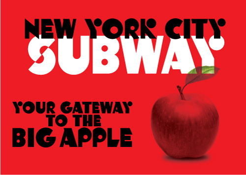
   The design inspiration was an amalgam of elements from existing team logos such as the Dodgers and Yankees as well as embroidery designs from companies that make sport jerseys. These all got combined into one cohesive original design that is Fenway Park. Named for the famed baseball stadium in Boston, it just seemed to be the perfect fit for the design.


   Fenway Park has proven to be one of the bestselling fonts in the Jukebox library, second only to Stephanie Marie. It was the first font I ever saw out in the world in a commercial application and I have since seen it on countless products, billboards, commercials, print media and many others. It is a true honor to have created something that has had such a far reach.


   The first known commercial use of Fenway Park was by the Southern Comfort whisky company. I saw one of their billboards on Fairfax Ave. in Los Angeles in November of 2002 and there was my font looking back at me! The company continued to use the font in various ways through the late 2000s. 

   Disneyland has been another heavy user of Fenway Park, having employed the font on much of its merchandise, especially clothing. 


   Fenway Park has also appeared in many TV shows and even film. It is seen on The Food Network in the opening title logo of “Sandwich King” which is chef Jeff Mauro’s show. Mauro was the season seven winner of “The Next Food Network Star”. Fenway Park was also use in the opening credits of the 2006 film “Thank You For Smoking” starring Aaron Eckhart and directed by Jason Reitman.


   This was a really fun font to design! I remember being very excited by the process at the time. I always love working on a new typeface of course, but this was one of those ones that just seemed to be “in the zone” for me. 

  Interestingly the original design contained a swooping “tail” element that could be added on to the end of a word similar to the ones you sometimes see on team logotypes. It never really worked however, because of the limitations of font technology—it couldn't be customized to fit varying word lengths. The swash element was removed when the library was relaunched as Jukebox in 2003. If you have a version with that swash, it is the original JAW Fonts version! 

   As with all of the other fonts in the Jukebox library, Fenway Park is available from Veer in OpenType format.


Wednesday, April 15, 2015

Font of the Week #40: Fanfare

   Good morning! I'm glad to see you back here again. This week’s featured font is “Fanfare” from the Jukebox collection.

Fanfare

   Fanfare is a digital revival that I created in 2004, making it one of the earlier Jukebox fonts. The original from which Fanfare was created was an old photo-typositing face called Phoenix that appeared in one of those old Dover type books.


   I was immediately drawn to this font because of its classic 1950s/1960 retro appearance. I thought it would make an excellent addition to the Jukebox collection and has been well received over the years. The modulated baseline adds to its charm and gives the font a childlike look which makes it perfect for any lighthearted subject or use.

   The endstrokes of the letters in Fanfare terminate in a pointed flared serif that give this typeface a vaguely Latin feel making it perfect for the menu of a Mexican restaurant or something similar.

   It also has other typically retro design features like the lower curve of the “S” being smaller than the top curve…the opposite of a more typical classical typeface. Similarly, the crossbars on the “E” and “F” are below the vertical midpoint of the letter, rather than above it.


   These kinds of fonts remind me of my childhood. Although I grew up as a small child in the 1970s, there was still a lot of carryover, especially in urban graphic design, from the late 50s and 60s. Fanfare is very similar to the lettering on the old Denny’s signs I remember as a kid. They have all gone the way of the Dodo much to my dismay. Today’s version seems to pale by comparison.

   As with the all the other fonts in the Jukebox library this was rereleased in 2012 in OpenType format and is available exclusively from Veer. This is a great choice for adding some playfulness to your designs!


Wednesday, April 1, 2015

Font of the Week #39: Fairy Tale

Hello again! After a necessary hiatus due to family medical issues I am finally back with Font of the Week Feature! This week we will take a look at one of the oldest Jukebox fonts…

Fairy Tale

   Fairy Tale was designed in early 2001 and was originally part of the JAW Fonts library that came before Jukebox. Based on the hand-lettered titles from the lobby posters of an old animated feature film, this font captures both the whimsy and fun of a fairy tale with the influences of old Blackletter fonts.


   It makes use of its Blackletter roots, while still being easily readable. In addition, the design is versatile enough to be either light and upbeat or more serious depending on the context in which it is used.

   Because this is one of my earlier fonts when I was still getting my bearings with the mechanics of typeface design, this font has some idiosyncrasies that add some warmth to the design. Its naiveté makes it more accessible and more flexible.


   Fairy Tale has been a fairly strong seller for Jukebox over the years and I have seen its use on many different venues. Perhaps the most exciting and close to my heart is that Fairy Tale has been the official font used for many years now for all the signage and promotional material for the “Mickey’s Halloween Party” event held during the months of September and October at Disneyland in CA.

   The font even appears on some of the floats that are used for the special Halloween parade that is shown on the nights of the event. To have my font chosen for such a widespread use by a company such as Disney is truly an honor. As a lover of both Disney and Halloween, I was quite excited the first time I saw the signs and brochures a few years ago!


   Fairy Tale is part of the Jukebox library sold exclusively through Veer. It is available in OpenType format.


Tuesday, January 20, 2015

Font of the Week #38: Event Horizon

   Hello! I hope you’ve had a great week and enjoyed your work holiday yesterday. This week’s font of the week is a fun one! So grab your astronaut helmet and let’s go!

Event Horizon

   The featured font for this week is a playful and retro Space Age design called “Event Horizon”. The font was inspired by a hand lettered advertisement from the 1960s. I took the few letters that appeared in the original sample and designed a full typeface from it.


   The font evokes the fun and innocent view that decades past had about the space age and the excitement surrounding it. With its “yesterday’s version of tomorrow” feeling it has more of Flash Gordon about it than Nasa. But that is exactly why I loved designing this font! As I’m sure you can tell, I’m a big fan of retro design. 

   The name comes from the theoretical horizon that forms around a black hole. Technically, it is the point where the escape velocity of the gravitional pull of the black hole becomes greater than the speed of light. It is the point of no return…the edge of the cliff so to speak. It’s not an actual physical surface, merely a point at which we can no longer see past. Once anything goes past that point it is forever cut off from our Universe. 


   The font was designed natively in OpenType in 2011, and includes an entire set of letters that have “speed lines” cut into them, under the Stylistic Alternates feature. This offers the user a fun and playful increase in functionality for the typeface. It gives that perfect high speed look!

   These speed lines are designed to alternately line up or not line up between letters which gives them a more dynamic appearance. As though the characters are speeding past a beam of light! This is also enhanced by the forward slant of the letters.

   Event Horizon is part of the Jukebox library sold exclusively through Veer. 


Tuesday, January 13, 2015

Font of the Week #37: Empyrean

  Hello again! It's always nice to see you back. Once again it's time for the font of the week and this time I am featuring my text family called “Empyrean”…

Empyrean

   The Empyrean font family represents the one and only time I set out to design an actual text face that could be used for printing books and or long passges of text. Most of the typefaces I design are meant for headline and display use, but I wanted to challenge myself to take on a text family which is a whole different animal.


   Empyrean is loosely based on the original hand-drawings for the “Romain du Roi” (French for ‘King’s Roman’) done in 1695 by Louis Simmoneau. King Louis XIV had ordered the design of a new royal typeface, and those original drawings came out of that process.

   I began working on Empyrean in early 2003. Originally the font had a different working name but I finally settled on calling it “Empyrean” just before releasing it commercially through Veer. The word Empyrean means “deriving from or related to heaven”…a seemingly appropriate name for a typeface based on a font made for the “Sun King”


   There are four weights in the Empyrean family…Roman, Bold, Italic and Swash Italic. The challenge in designing a text face like this is getting all of the four faces to work together harmoniously as well as tackle the specific needs of a typeface intended for text use. Designing fonts for display use is much more fun and free as the designer has more leeway into what can be done with the letters. Text faces must be designed and spaced very precisely. As any artist is never able to see his or her own work objectively (try as they might) I cannot judge if Empyrean is a success or not, but I was pleased with the end result and customers seem to like it. It was a fun challenge that I enjoyed! As to whether I would do a text family again? We’ll see…


   Each of the four weights in the Empyrean family can be purchased separately or the whole typeface family can be purchased at a lower price than 4 x the individual price. Empyrean is available in OpenType format from Veer.


Tuesday, January 6, 2015

Font of the Week #36: Eloquent Pro

   Hello! It's great to have you back again. This is a special week for two reasons. First, this is my first “Font of the Week” post for 2015 and second, this week’s font feature is very special. We will take a closer look at my font family called “Eloquent”.

Eloquent

  Back in late 2008 I received an email from Grant Hutchinson at Veer. Through the years, Grant and I had conferred many times on which font would make good additions to the Jukebox library. In this particular email, Grant suggestied that I take a look at and old photo-typositing face from the Photo Lettering Inc. library called “Pistilli Roman”. He sent me some samples along with the email.

   This beautiful did one style font had heavy contrast between thick and thin strokes and the thin strokes were like hairlines. The original Pistilli font had never been converted into digital format. Grant and I decided to recreate it and add it to the Jukebox library.


   I began work on this digital revival in early 2009 and it was finished later that same year. The original Pistilli Roman font was one roman face and despite much research I could never find an accompanying italic. As far as I know Pistilli never published one, so I set about designing one that would match to make a complete family set. I expanded the family to also include a small caps for both roman and italic and added a full set of swashes to each typeface.

   Eloquent has been a very popular seller for Jukebox and is one of my top 5 most successful typefaces. About a year after Eloquent was released to the public, I was contacted by Italian Vanity Fair to design a custom “caption” version for use at small print sizes. All versions are available from Veer.

   In addition to this, I was honored to have “Eloquent” chosen as one of the 25 winners of Communication Arts magazine ‘Best in Typeface Design’ for their 2011 Typography Annual. 


   Unlike some of the older Jukebox fonts which were later converted to OpenType, Eloquent was designed natively in this format. I made use of many of the special features of OT typefaces. Eloquent is part of the Jukebox library and is available from Veer.